Illustration and Visual Narrative Task 1 / Exercises
7/4/2023 - 19/5/2023 (Week 1 - Week 7)
Kiran Hwang Kyezen / 0349180
Illustration and Visual Narrative / Bachelor of Design (Honours) in Creative
Media
Task 1 / Exercises
LECTURES
Week 1 - Introduction
For the first week, Mr. Hafiz introduced us to the module as well as a
briefing on what is expected as the weeks progress.
We were introduced to Adobe Illustrator and its benefits such as how its focus
is vector art, which its main benefit is to maintain image quality no matter
the distortion. However, due to the software not being distributed yet at the
time, we had difficulties in the practical lesson.
Instead, we were also tasked with trying out the "Bézier game" which is
intended to help newcomers practice using the pen tool. We were also taught
several features of Adobe Illustrator such as workspaces, grouping, and
several tools shown in the toolbar.
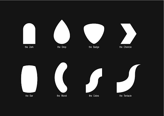
After explaining the features, we were tasked to trace out vormator shapes
provided if possible. These shapes will be used for the upcoming exercise.
Figure 1.1 - Vormator shapes
Week 2 - Character design
On the second week, we were given a video lecture by Ms. Anis on character
design. The video highlights points on what makes a good character design such
as stylized design. the three main factors of stylized design are
- Iconic - You are able to recognize it simply by its silhouette
- Simplicity - Simplicity allows the audience to take in the design easily
- Unique - Combining iconic and simplicity makes a unique character, making them more memorable to the audience
Next, the principles of a stylized design were explained
- Shapes - Used to identify a character from one another
- Colour - Can play an important role in classifying whether a character is good or bad.
- For example, blue signifying the hero and red signifying the villain.
- Can also be used in color psychology, for example, as red for anger, blue for sadness, yellow for joy
- Emphasis/Contrast - Using colors to create emphasis on a character, making them stand out
- Harmony - Design elements should compliment each other
- Expressions/Poses - Gives the audience a clear visualization of your character's quirks or personality
Figure 1.2 - Principles of stylized designs
Week 3 - Colour
On the third week, Mr. Hafiz explained the various ways to colour, which are
- Standard fill tool - Using the group function to select multiple shapes, then select a colour to change all of them at once. Individual shapes can still be coloured in isolation from others by double clicking them
- Gradient tool - A graduated blend of two or more colours, These blends can bring a different visual effect that a singular colour is unable to provide.
- Shadows - Can be created using the shape builder tool and overlapping a shape into part of your artwork before subtracting it out.
Week 4 - Tools
On week 4, we were taught on how to use various tools in Adobe Illustrator.
- Pencil tool - Used to design freeform paths. Allows the adding of strokes and anchor points with no restrictions unlike the pen tool. Smoothness/accuracy can be changed in the settings and paths can be edited by simply drawing a new path over the existing path.
- Smooth tool - Typically used with the pencil tool to smoothen rough edges that may be undesirable when using the pencil tool.
- Shaper tool - Allows the creation of shapes simply by drawing loose gestures of them (drawing the rough outline of a hexagon will create a hexagon shape)
- Width tool - Used to adjust the width of a stroke
Week 5 - 3D
On week 5, we were given a basic tutorial on the 3D function in Adobe
Illustrator. It allows the generation of 3D images based off vector images.
In order to get comfortable with the 3D function, we were given an exercise to
apply 3D effects on a rainbow vector image that we created
Figure 1.3 - Applying 3D effects on rainbow vector image (5/5/2023)
The intersect function was also explained
- Intersect tool - Allows the selection of two elements and manipulation of them to intersect one another
INSTRUCTIONS
Hyperlink - <iframe src="https://drive.google.com/file/d/1j9uheSb2Cx1QRyj2THnyJ_kyeZLSmM1W/preview" width="640" height="480" allow="autoplay"></iframe>
Exercise 1 - Vormator challenge
For our first exercise, we were tasked to design a character using only
the vormator shapes we were instructed to trace. The challenge for this
particular exercise is that we are not allowed to distort the shapes
(e.g resizing). However, we are allowed to subtract and group shapes
together to create new ones. This task will be done in Adobe
Illustrator.
Before starting, I took note of the principles of stylized design and
ensured the character that I will be designing is following these
principles. I decided to go with designing a slime, which has a simple
design, yet is identifiable from the silhouette alone.
Next, I looked on the internet for references before I began designing
my outline, after that, I used the vormator shapes and combined them
while adjusting the line opacity in order to create a rough outline.
Figure 2.1 - Rough outline of slime body (21/4/2023)
Afterwards, I used the shape builder tool to connect the vormator shapes
and form the main body. I also used the pathfinder tool to create the
body parts for the character such as the eyes and mouth. This can be
seen in figure 3.2 and 3.3 below. The final shapes are on the left,
while the vormator shapes used are
Figure 2.3 - Shapes created (left) and the vormator shapes used
(right) (21/4/2023)
Figure 2.4 - Final outline of vormator character (21/4/2023)
After the outline is finalized, I began colouring the vormator character. The eyedropper tool was used to take the colours from the reference and then the fill tool was used to add colour to the shapes.
Figure 2.5 - Initial colour of the vormator character (21/4/2023)
After initial colouring, I added shadows and detail by changing the shades
of the initial colours chosen to darker ones simply by utilizing the
colour mixer tool.
While colouring, I was unsatisfied with the size of the mouth. However, we were not allowed to change the size of it by freely resizing as it would be counted as distortion. To overcome this problem, I created a copy of the mouth and changed it to the same colour as the initial body, after that, I placed it over the black mouth to make it appear smaller.
The final result is shown below in figure 3.6.
Figure 2.6 - Final outcome of vormator character (21/4/2023)
Shapes used in final outcome
Zerk - 38
Badge - 15
Wurst - 4
Tentacle - 1
Exercise 2 - Illustrated Typography
For our second exercise, we are required to create a design surrounding the
definition of two words selected by a random word generator called
Pictionary. This exercise encourages us to combine the functions and tools
in Adobe Illustrator together with what we have learnt in Typography.
Figure 3.1 - Pictionary selecting the words "Sand" and "Rainstorm"
Before starting my illustrated typography, I decided to look up references
on the internet in order to gain an idea of how to begin the sketching
process
Figure 3.2 - Reference image for rainstorm
After looking up reference images, I began the sketching process of my illustration using the pencil tool which we have recently learned in our lectures.
Firstly, I drew a rough sketch of a puddle using the pencil tool and then made
slight edits to the initial shape by drawing over the existing paths. Once I
was satisfied, I drew the final outline.
Figure 3.4 - Outline of puddle (12/5/2023)
Next, I created the text aspect of the illustration by using the text box
function. The font I chose for the assignment was Segoe Print Bold as it was
the most appealing and suited for the illustration out of the other fonts I
tried.
Figure 3.5 - Initial text using text box tool (12/5/2023)
After creation of the text and puddle in two separate layers, I used the
eyedropper tool to select the color from the sand reference and used it to
change the fill of the text. Next, I changed the colour of the sand fill to be
slightly darker for the outline of the text. In order to make the text appear
more natural, I used the shear function to change the angle so it lays better
on the puddle.
Figure 3.6 - Typography after shearing and colouring (12/5/2023)
After working on the text, I hid the layer and started colouring the puddle
using the stroke colour of the text as the fill.
Figure 3.8 - Puddle after adding outline and details (12/5/2023)
After that, I began drawing the rainstorm aspect of the illustration. I drew
the raindrops with a lower opacity in order to ensure it was matched with the
created ripples on the puddle.
Figure 3.9 - Adding raindrops at lower opacity (12/5/2023)
Figure 3.10 - Final outcome of illustrated typography (19/5/2023)
REFLECTION
Experience
The first several weeks of the module introduced Adobe Illustrator, there
were difficulties regarding the software as it had not been provided to us
at the start of the semester and therefore progress was slightly slower.
However, I eventually began to grasp the software as weeks
progressed.
Observations
Lessons were mainly conducted on campus through tutorials teaching the
basics of Adobe Illustrator either with video or Mr. Hafiz providing a
demonstration of his own.
Findings
Adobe Illustrator although slightly more confusing to use than other
software, have a variety of functions that can make work more convenient
such as smoothening of the pen and pencil tools, as well as using the
pathfinder tool to create new shapes.


Comments
Post a Comment