Typography Task 2 / Exercises
2/5/2023 - 26/5/2023 (Week 5 - Week 8)
Kiran Hwang Kyezen / 0349180
Typography / Bachelor of Design (Honours) in Creative Media
Task 2 / Exercises
LECTURES
Lectures can be referred to
here
INSTRUCTIONS
Hyperlink - <iframe
src="https://drive.google.com/file/d/1msBb-81sFI0UACcRQaiyGy3rc21cCSuR/preview"
width="640" height="480" allow="autoplay"></iframe>
Task 2: Exercises - Typographic exploration & communication (Text
formatting & expression)
For task 2, we are required to express typographically the content provided from a choice of 3 texts.
We are to understand the content in these texts before proceeding to create
a two page editorial spread with it utilizing type expression as well.
Things to keep in mind for this assignment
- Dimensions of each page must be 200mm x 200mm
- Utilize only the 10 typefaces
- No images are allowed
- Graphical elements are allowed but only minimal usage such as lines/shades
1.1 Research
Before beginning the sketching for layouts, we are tasked to select one of the
3 texts provided in which we must read and understand the context and meaning
behind it. This assists in providing a clearer picture on how to create the
type expression for the assignment.
The text I selected out of the 3 was "A Code to Build on and Live By". This
text goes into details of ethical codes that designers should follow in order
to prevent going astray morally.
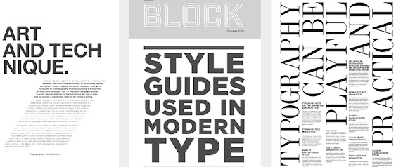
After understanding the meaning behind the text, I searched online for layout
ideas that will help to give me an idea of how to begin with the design
process of the type expression.
Figure 1.1 - Examples of layouts for type expression and text formatting
1.2 - Drafting
After getting an idea of how to go about the assignment, I started creating
several type expressions in Adobe Illustrator that would encapsulate the
meaning that the text intends to convey.
Figure 2.1 - First idea for type expression (6/5/2023)
My first idea for the type expression was to create a building in order to
symbolize how the codes in the text form a strong foundation for a designer.
The type expression was done simply utilizing the line tool and adjusting the
stroke thickness to make the lines more pronounced.
Figure 2.2 - Second idea for type expression (6/5/2023)
I also created a second design with the intention of creating a shape
resembling a staircase using the words in order to create an effect of how the
words are building on top of each other. The words were rearranged and the
line tool was used again.
1.3 - Layout
After comparing the two type expressions side by side, I decided to choose the
first idea as it was more pronounced in expressing the meaning of the text
compared to the second one.
Next, I started the text formatting part of the assignment while also
adjusting the position of the type expression to best suit the editorial
spread.
Figure 3.1 - First layout draft (6/5/2023)
Figure 3.2 - Second layout draft (6/5/2023)
After looking at the first draft, I tried moving the text in the third column
to the middle to try and see if the white space created was appealing.
Figure 3.3 - Third layout draft (6/5/2023)
Ultimately, after looking at all three layouts, I decided to go with the first
layout as it white space created at the bottom looked more appealing and the
text was more aligned with one another across columns which made it easier on
the eyes to read.
1.4 - Final outcome
After taking into consideration the feedback from weeks 6 and 7, adjustments
were made to the layout such as slight repositioning of the text as well as
the graphical design in order to make it more aligned overall.
Head
Font/s: Bembo Std Semibold
Type Size/s: 80 pt (A), 72 pt (Code, Build), 60 pt (To, By, And Live On)
Leading: -
Paragraph spacing: -
Subheading
Font/s: Janson Text LT Std 75 Bold
Type Size/s: 14 pt
Leading: -
Paragraph spacing: -
Body
Font/s: Gill Sans Std Regular
Type Size/s: 8 pt
Leading: 9.6 pt
Paragraph spacing: 9.6 pt
Characters per line: 47
Alignment: Left justified
Margins
Top: 10 mm
Bottom: 10 mm
Left: 10 mm
Right: 10 mm
Columns: 3
Gutter: 5 mm
Figure 4.1 - Final outcome of task 2 (without baseline grids) (26/5/2023)
Figure 4.2 - Final outcome of task 2 (without baseline grids) (PDF) (26/5/2023)
Figure 4.3 - Final outcome of task 2 (with baseline grids) (26/5/2023)
Figure 4.4 - Figure 4.3 - Final outcome of task 2 (with baseline grids) (PDF) (26/5/2023)
FEEDBACK
Week 6
General Feedback -
The usage of Bodini font as body text is not recommended as it has a bad
readability. Avoid positioning text horizontally as it can be difficult
for readers (e.g they have to turn their head). Central alignment is
an unsuitable alignment for body text.
Specific Feedback -
Be careful of rivers when using the justify alignment. Ensure you make
use of grids to align your bodies of text. Try to make type expression
match the words while minimizing certain details (e.g no need to make
certain letters in type expression extremely large)
Week 7
General Feedback -
Refrain from placing your headline in the gutter of your columns as it
is not very appealing to the eye.
Specific Feedback -
Try to use less condensed fonts for your body text as it can affect
the readability of the text.
REFLECTIONS
Experience
Weeks 5 to 7 have been slightly easier due to the assignment simply
requiring the utilization of what was learnt from the first 4 weeks.
The experience obtained from the first two exercises from the first
task made the work less challenging overall.
Observation
A good layout is more than simply arranging text boxes around. The
importance of hierarchy is highlighted in this exercise as it allows
the reader to have an organized flow throughout the layout. Body
text thickness also plays an important part as it can cause readers
to struggle with the readability of the overall layout.
Findings
Through task 2, the foundation of type expressions and text
formatting from task 1 was strengthened further. I was also able to
improve my kerning and tracking through this task as well as better
understanding of use of fonts.
FURTHER READING
Figure 5.1 - Typoguide by Benedikt Lehnert
For further reading, I have chosen the book "Typoguide" by Benedikt Lehnert.
The main points I took from this book were regarding mixing typefaces and as
well as font size and line height
- Sometimes, simply changing the weight or size of a font can be just as effective if not better than mixing typefaces
- Readability is important to text, a comfortable body text font size is usually 9-12 points for prints and 10-14 pt for screens.
- For mixing typefaces, looking for typeface families that offer both serif and sans-serif characters, otherwise known as twins, can reduce the chance your typeface combination looks out of place from one another.


Comments
Post a Comment